#design
Michał Uzdowski
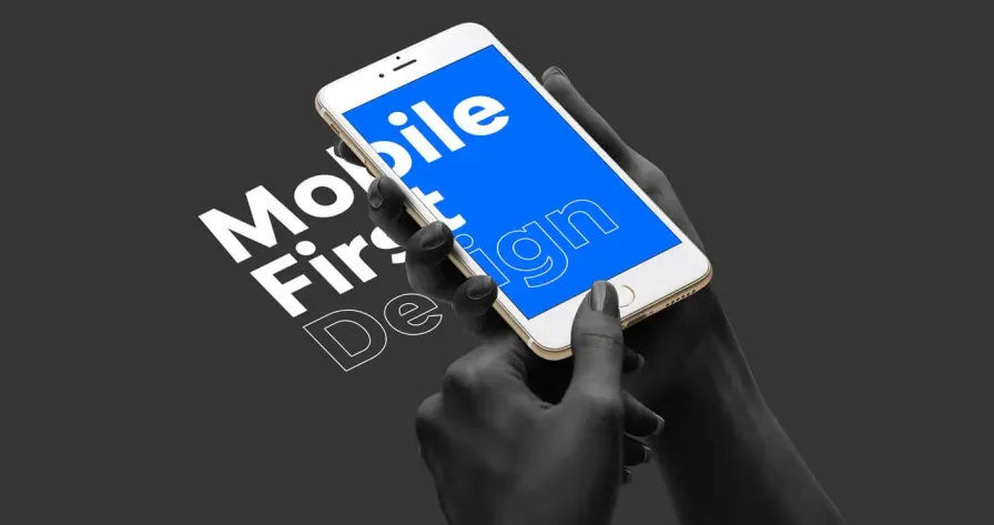
Building a mobile-first web application: Best practices
Welcome back to Binary Brain, where we take the complex and make it comprehensible — with a generous side of humor, of course. Today, we’re tackling a topic that’s as crucial as charging your phone before a long trip: Building a Mobile-First Web Application. In a world where everyone and their grandma has a smartphone glued to their hand, designing for mobile first isn’t just a nice-to-have — it’s a must. So, grab your favorite device (hopefully a mobile one), and let’s dive into the best practices for building a mobile-first web application.
Why Mobile-First Matters
Before we start coding like mad, let’s talk about why mobile-first design is so important.
User Behavior
According to recent studies, over 54% of global web traffic comes from mobile devices. People are browsing, shopping, and doomscrolling on their phones more than ever before.
If the web were a party, mobile users would be the cool kids that everyone wants to impress. You wouldn’t throw a party and forget to invite them, right? So why design a website without considering mobile users first?
SEO Benefits
Google has adopted mobile-first indexing, meaning the mobile version of your site is the starting point for what Google includes in their index and how they determine rankings.
Think of it as Google’s way of saying, “I’ll judge your house based on how tidy your living room is, not your basement.” If your mobile site is a mess, good luck ranking well!
Accessibility and Reach
A mobile-first approach ensures that your application is accessible to a broader audience, including those who rely solely on mobile devices to access the web.
It’s like making sure everyone at the concert has a seat, not just the VIPs in the front row. The better the mobile experience, the more inclusive your site becomes.
Step 1: Start with a Simple, Responsive Design
The first rule of mobile-first web development is to keep it simple. Start with a design that looks great on the smallest screen and scale up from there. It’s easier to add elements for larger screens than it is to cram too much into a small space.
Minimalist Approach
Mobile screens are smaller, so focus on what’s essential. Prioritize content that users are most likely to interact with on the go.
Start with a basic layout — think single-column designs, large buttons, and easy navigation. Use a grid system like CSS Grid or Flexbox to ensure your layout adapts gracefully to different screen sizes.
Designing for mobile is like packing for a weekend trip. You don’t need your entire wardrobe — just the essentials.
Responsive Images and Media
Mobile users are often on slower networks, so optimizing images and media is crucial for performance.
Use responsive image techniques like the srcset attribute in HTML to serve different image sizes based on the user’s device. Compress images using tools like TinyPNG or ImageOptim, and consider using modern formats like WebP.
Sending full-size images to a mobile device is like trying to fit a grand piano through a doggy door. It’s not going to work out well for anyone involved.
Touch-Friendly UI Elements
Fingers are not as precise as mouse pointers, so your UI needs to be touch-friendly.
Make buttons and links large enough to tap easily, with plenty of space around them to avoid misclicks. Aim for a minimum touch target size of 44x44 pixels, as recommended by Apple.
Think of your UI elements as door handles. You wouldn’t want to struggle every time you tried to open a door, so make sure your buttons are easy to press!
Step 2: Optimize for Performance
Performance is a big deal on mobile. Users expect sites to load quickly, and Google will ding you if they don’t. Here’s how to keep your mobile-first web app running at top speed:
Minimize HTTP Requests
Each HTTP request adds to your page’s load time, which is especially problematic on mobile networks.
Combine CSS and JavaScript files where possible, use CSS sprites for images, and preload critical resources.
Imagine every HTTP request is like sending someone to the store. The more trips they make, the longer it takes to get everything you need. Better to make one big trip and get it all done at once!
Lazy Loading
Loading all your content at once can overwhelm users with slow connections and increase load times.
Implement lazy loading for images and videos, so they only load when they come into view. You can do this easily with the loading="lazy" attribute in HTML5 or with JavaScript libraries like lazysizes.
Lazy loading is like waiting to open your birthday presents until the guests arrive. Why rush when you can enjoy them at the right moment?
Optimize JavaScript
Bloated JavaScript can slow down your site’s load time and make it feel sluggish on mobile devices.
Minify your JavaScript files, defer non-critical scripts, and avoid using heavy libraries when a lighter option will do. Tools like Webpack can help you bundle and minify your code efficiently.
Think of unoptimized JavaScript as carrying around a backpack full of bricks. Sure, you can do it, but wouldn’t you rather travel light?
Enable Compression
Compressing your files before they’re sent to the user’s device reduces load times and saves bandwidth.
Enable Gzip or Brotli compression on your server to reduce the size of HTML, CSS, and JavaScript files.
Compression is like vacuum-sealing your clothes before packing them into a suitcase. You can fit more in, and everything arrives neat and tidy.
Step 3: Focus on Accessibility
Accessibility is crucial for a mobile-first web application. Designing with accessibility in mind ensures that everyone, including users with disabilities, can interact with your site effectively.
Use Semantic HTML
Semantic HTML helps screen readers and other assistive technologies understand your content, making it more accessible.
Use proper HTML tags like <header>, <nav>, <main>, and <footer> to structure your content. Don’t rely on <div>s for everything.
Think of semantic HTML as the difference between a well-organized filing cabinet and a junk drawer. One’s easy to navigate, the other… not so much.
Color Contrast and Text Size
Low contrast and tiny text make it difficult for users with visual impairments to read your content.
Ensure sufficient contrast between text and background colors using tools like the WebAIM Contrast Checker. Use relative units like em or rem for font sizes to allow users to adjust text size as needed.
Imagine trying to read the fine print on a contract after a night out. Not easy, right? Make sure your text is clear and legible for everyone.
Keyboard and Touch Navigation
Some users rely on keyboard navigation or assistive devices to interact with your site.
Ensure all interactive elements are accessible via keyboard, and use :focus states to highlight them. Test your site’s navigation without a mouse to ensure a smooth experience.
If your site were a party, you’d want to make sure there are ramps for everyone—not just stairs. Inclusive design ensures everyone gets to join the fun.
Alt Text for Images
Alt text provides descriptions for images, making your content accessible to users with screen readers.
Write descriptive alt text for every image on your site, explaining what the image shows and its context within the content.
Alt text is like providing captions for a silent film. It helps everyone understand what’s happening, even if they can’t see the visuals.
Step 4: Embrace Mobile-First Navigation
Navigation is key to a great user experience, especially on mobile. Traditional menus and sidebars don’t always work well on smaller screens, so you’ll need to rethink your approach.
Simplify the Menu
A cluttered menu can overwhelm users on small screens and make it difficult to find what they’re looking for.
Use a hamburger menu or collapsible navigation bar to keep things tidy. Prioritize the most important links and group related items together.
Think of your mobile menu as a well-organized closet. You want to be able to find your favorite shirt quickly without digging through a pile of stuff.
Sticky Navigation
Keeping the navigation bar accessible at all times improves usability, especially on long-scrolling pages.
Implement sticky navigation that stays at the top or bottom of the screen as users scroll. Just make sure it doesn’t take up too much space or obscure content.
Sticky navigation is like having a map in your back pocket. No matter where you wander, you can always find your way home.
One-Handed Use
Many users interact with their phones using one hand, so your navigation should be easy to use without needing to stretch or shift your grip.
Place primary navigation elements within easy reach of the thumb, usually at the bottom of the screen. Consider using gestures or swipe actions for secondary functions.
Designing for one-handed use is like arranging your kitchen so you can grab a snack without putting down your drink. Convenience is key!
Step 5: Test, Test, and Test Again
Finally, testing is crucial to ensure your mobile-first web application works flawlessly across different devices, screen sizes, and operating systems.
Device Testing
Your site may look great on one device but break on another. Testing across multiple devices ensures consistency and quality.
Use real devices or emulators to test your site on various screen sizes, resolutions, and operating systems. Tools like BrowserStack and Responsinator can help you see how your site performs across different environments.
Testing on multiple devices is like taste-testing a dish before serving it. You want to make sure it’s just right for everyone, no matter their palate.
Performance Testing
Mobile users expect fast load times, and poor performance can drive them away.
Use tools like Google Lighthouse, GTmetrix, or WebPageTest to measure your site’s performance and identify areas for improvement. Focus on reducing load times, optimizing assets, and minimizing resource usage.
Performance testing is like checking your tire pressure before a road trip. It’s essential for a smooth ride and avoiding breakdowns.
Usability Testing
Even the best-designed site can fall short if users struggle to navigate it or accomplish their goals.
Conduct usability testing with real users to gather feedback on your site’s design, functionality, and overall user experience. Use tools like UserTesting or Hotjar to collect data and insights.
Usability testing is like having a friend proofread your novel before publication. They’ll catch the plot holes and typos you might have missed.
Accessibility Testing
Ensuring your site is accessible to all users is not just a best practice — it’s a legal requirement in many cases.
Use tools like Axe, Wave, or Lighthouse to test your site’s accessibility and identify issues. Conduct manual testing with screen readers and other assistive technologies to ensure a smooth experience for all users.
Accessibility testing is like making sure everyone at your party has a comfortable chair, regardless of their height or age. It’s about being a good host.
Conclusion
Building a mobile-first web application is like crafting a finely-tuned machine. It requires careful planning, thoughtful design, and rigorous testing to ensure it performs well on every device and provides a great user experience. By following these best practices, you’ll be well on your way to creating a web app that’s not only functional but also a joy to use — whether your users are on their phones, tablets, or desktops.
So, go forth and build with confidence! And remember, at Binary Brain, we’re always here to guide you through the complexities of web development with a dash of humor and plenty of useful tips. Happy coding!